Thursday, May 31, 2012

Paper Cutouts


My ratios of inspiration is Kara Walker.  She is a modern day artist who used paper cut outs to make beautiful pictures.  She was born in 1969 in Stockton California.  Her artwork inspires me because even though it is back and white silhouettes, you can clearly see the picture that she is trying to form and there is a distinct depth of field..  She sticks too a strict color scheme of black and white paper.  I had never heard of paper cutout art before and I really like the idea.  Her artwork is very balanced.  Even though the black paper in her ratios dominant, there is a very good sense of balance to each piece of art.He art represents resourcefulness because she went outside of her comfort zone of painting and printmaking and explored other materials and new techniques of art.  I really like how detailed and whimsical her art is.  She has lots of variety in her art: from landscapes, to symmetrical ballerinas.  I used that variety in my two pieces of art.  I went from a very basic picture of a little girl and a dog in a wagon, to a very detailed image of a young couple under a tree. 


I was resourceful when completing my piece by searching for many artists on the internet, finding two completely different pictures and putting them together, and trying out different ways to cut the paper.  I used intellectual curiosity when I was looking for artists to model my art after.  Most of the artists I saw where photographers and I wanted to do something different and unique so I looked up Kara Walker.  This project represents the quality of my work that I completed this year because I sampled different techniques and planned my idea before starting to make the piece.


selenas final free form shelf project


I felt that this project was a milestone for me because I got it done on time, and chose a project that was completely out of my comfort zone for me allowing me to experiment with power tools and furniture design. The reason I choose to do something of that nature is purely for fun and because I wanted to prepare my self for my summer workshop at RISD. I've always been fascinated with geometric designs and 3D artwork and I thought that this project was absolutely irresistible. I created this piece using ________ instead of using plywood purely because it was cheaper and it seemed smoother, giving off a cleaner finish. I got inspiration from a book that was given to me and in that book it gave certain measurements on how to achieve the design. When looking at the picture you would think this looks very difficult to achieve however it is simply made out of a variety of triangular pieces of two separate sizes that are fit together with groves cut into each other and zip ties to secure them. All you do is repeat your tenique and you get a cascading geometric shelf. I had quite a bit of trouble dealing with applying a finish to the boards and having them come out half way decent looking however I discovered if I use a primer before it greatly improved the quality of the finish. Some success was finally being able to use power tools such as a power saw and a drill press in order to obtain a more perfect result as well as experimenting with countersinking. The mediums i used was _______ board because it was cheaper then ply wood, primer to achieve a higher quality look, black glossy finish to symbolize a futuristic modern look, and stainless steel zip ties to give it a sleek clean look. Although there is no parttern because the color scheme is esientally all black I think the visual depth(or depth of feild) of it protruding off the wall and going back is very interesting


Grade Defense

I was resourceful because I used power tools to speed up the process, utilized my dads metals and power tools skills to teach me some new techniques and chose a project that I had already started on my own time, thus giving me a little bit of a head start so I was able to turn it in on time. I used intellectual curiosity in the project by deciding to try to create my own design and come up with something new rather then the deign presented in the book. This piece I think reflects my work this year by expressing my experimentation with new mediums and techniques for example. My lips painting I used oil painting that was a completely new medium for me use and also the maps girl was another challenge using everything out of paper!  

Savanah Stuart's Public Art (Not the picture of actual artwork)


For my public art piece I was inspired by the picture above.  This piece was done on an abandoned building.  To make the mixture, the following ingredients were mixed in a blender: moss, water retention gel, buttermilk, water, and a small amount of plant food.  After the mixture is fully mixed you apply it to the wall or area of your choice.  I chose to do my piece on a large cork-board after looking through all the readily available materials.  I decided that I wanted to use the word "prosper" for my moss graffiti.  I thought that this word perfectly fit the scenario the moss was growing in.  Moss obviously does not naturally grow on cork-boards, but with the right tools it can 'prosper' and defy normal standards.  I really wanted people to apply this to their own personal lives, but unfortunately my piece did not hold up.  Before I was able to properly photograph it, the mixture had dried up.  I believe that this occurred because of a high exposure of sunlight.  Over the summer I hope to try this project again with better results.  I think that if the moss is in a more shaded area and constantly moist, it will successfully grow.  I was inspired by the unnatural growth of the moss on the building above and I hope that in the future I can inspire others with the same project like this piece inspired me.

Hunter Johnson - The Golden Ocean


Hunter Johnsons Blog 

The Golden Ocean!


My inspiration for this piece was on my drive home from school every day seeing the sunset from my house.  One day I came home from school and Googled my favorite picture of a sunset beach that I could find.  I felt this picture needed something more, so I took the original picture and duplicated it.  On the top layer I went to "image-adjustments-hue/saturation" and turned "saturation" all the way down thus causing the picture to be black and white.  Then I erased the ocean and the most colorful part of the clouds, after the colors of the sunset shined through.  This medium of this picture was odiously taken as a photograph but still looks beautiful.  I chose a photo because lately I have been drawing abstract and painting but I wanted to get out of my comfort zone and wanted to see how it would turn out.


When I was working on this piece, I was very resourceful because on google it took me about 10 min. just to find the photograph that I thought was the best.  I was wasn't sure weather I should choose a picture of a beach or a sunset beach.  I ended up just choosing a sunset beach because I couldn't decide.  I was very intellectually curious making this picture.  I asked lots of questions and for advise.  I was not sure what to do on the picture but it ended up amazing.  This piece reflects on my work this hole year because it shows how I use my surroundings in my work and I try and do my best because at everything I do.

Aubree Ochoa's Final Project and Grade Defense- Rose Photoshop


           My inspiration for this project was how mysterious, yet beautiful nature is. I decided to use this image because it was close up, which would show a lot of detail. Originally, this rose was was a very light pristine pink. I decided to use background simplified to mainly focus on the flower. Originally, I wanted the flower to be a dark red, but then decided to use a sunset orange to create a warm color scheme. Since the pink flower had a couple dark brown blemishes,  I decided edit these out. This was challenge though, because I had to find the perfect shade of pink to perfect the rose. When I was done with that and changed the coloring, I wanted the flower to have a glowing effect to symbolize the magic in nature. I decided to use this photo as my Final Project because I felt that this piece showed how much time and effort and I put into making it.


The Original Photo I Took

               I feel that I was resourceful when I used the Photoshop stamp tool to hide the dark brown blemishes instead of using the air brush tool. I felt that this would be the most effective because it would reflect a real flowers looks. I feel that I was Intellectually Curious during this project because I had been very excited to start photo editing, which helped me put more effort into my project. This piece represents the quality of my work this year because I am always excited to create art, which helps me to put a lot of effort into all of my pieces.

Marissa's Stained Glass Flowers


My inspiration for this project was how we mix technology with nature. I used photoshop to create a stained glass effect in the background. At first, I had a bit of trouble with photoshop but I got the hang of it and created this. I really like it and I think it represents the mix of technology and nature well. I added the stained glass because it really made the flowers pop.

I was resourceful in many ways. For one, I had to look really hard for something to photograph. I got down very low (laying down, actually) to take this picture. I really like taking pictures of things people tend not to notice. Then, once I took the picture, I edited it. At first, I didn't know what I was going to do. Would I make it black and white? Would I add more flowers? It pondered me for quite some time. After a lot of experimenting, I got the stained glass effect. This represents my quality of work because I do a lot of experimenting before I end up with my final, original, product. I have never seen a picture like it and I love it.


Wednesday, May 30, 2012

"Color Pop"


My artist of inspiration is Niki de Saint Phalle. She created art from the 1980s to the early 2000s. She was alive at the time of New Realism. She is a sculpture artist and she has sculptures all over San Diego County and Europe. While this may be true, I did not base my art project off of her sculptures. Niki de Saint Phalle also did another form of art where she would paint over a colorful canvas and then shoot the canvas with a shotgun. Her work inspires me because the balance of her work is spontaneous, asymmetrical, and colorful. I think the way she puts paint on the canvas varies and is beautifully executed. I like the variety of colors and the fact that there is not really any particular pattern to her work. Her work and mine represent perseverance because both her and my art work require problem solving and planning.
For my project I painted a canvas white and then put thumbtacks into the bottom if the canvas facing up. I then filled many balloons with paint and then I threw the balloons at the canvas. My work represents resourcefulness because I had to figure out how to get the paint in to the balloons. It took me a lot of time and thought to figure out the perfect way to get only paint into the balloons. I was intellectually curious when it came to this piece because I originally wanted to use warm and cool colors but then I ended up just using cool colors. My work represents me in the sense that I am very spontaneous and so is my work. The quality of this piece reflects all of my other pieces this year because I worked as hard on this one as all the rest and it came out as good as all my others.  

"Eyes of Paradise"


My artist of inspiration is Hannah Höch. The style of art that she does is Dada Cordial. She was creating her most known art in the 1920`s-`1940`s. Her work inspires me because I really enjoy doing collage and I really enjoyed the spontaneous aspect of her artwork. Her work incorporates the school value of perseverance. I think this is because it takes a while to collage and choose the pictures you want to use on your piece, and even though you might want to give up, you keep on trying and persevering to finish it.

 When I was completing my piece, I was resourceful because I researched a lot of different artist before choosing her. My intellectual curiosity was enhanced when doing this project because I had to figured out how to create depth of field, such as with the shapes, sizes, placing, balancing out where everything will go, as well as the negative space.  I also used a variety of different patterns and pictures that show a lot of texture. With the eyes, I tried to use complementary colors next to each other, such as putting purple eyes next to gold eyes.  I also used repetition in my piece by using only eyes in the bouquet and the same type of nail polish bottles throughout the bottom of the piece.  I think this piece represents the quality of my work this year because I worked really hard and even if I have a tough time with a project, I always preserver and keep going with it.


Monday, May 21, 2012


My block print is a wolf howling with the city and forest in the background.  The wolf symbolizes a cry for help and the city is supposed to represent the future if we don't change it. Then the forest is supposed to represent what we have now and how we are slowly losing it with technology. They are fighting against each other and that’s why I wrote change can happen on the bottom because I believe we can find a new type of technology that’s better for the earth and our future. People understood what my message was because of my imagery and text.

We put up our block prints at the Cardiff Kook, Swammys, downtown Encinitas, and downtown San Diego. I felt excited to put them up because it was fun and I knew people would look at them and look at our messages. I also felt kind of nervous because I dint know what peoples action was going to be. I didn’t know if they were going to like it or throw it on the ground and trash all of our work.

The publics’ reaction was really good. While we were putting up the block prints people had different reactions. Some people didn’t know what we were doing and seemed kind of concerned, while others would look at us to see what we were doing. Once we put up all the block prints people would stare at them and looked like they wanted to know more. They seemed really interested in them. 


Bomb Girl


The name of my block print is “Bomb Girl”. I choose to make my print a girl dragging a bomb because I was inspired by Banksy art with a girl hugging a missile. As a class we put our art up around downtown Encinitas and downtown San Diego. We also posted prints around school to decorate for Grauerpalooza. I think the most successful place where I put my art was on the Nixon wooden wall in Encinitas or behind the stage for Grauerpalooza. Students recognized my block print and they want to use my print for their band logo. The print did not have a set meaning to it… I just wanted people to make up their own thoughts/meaning about it. 

Selena $OCIETY public art peice

For this project I decided to put a quirky twist on the common crosswalk and pedestrian sign. My idea was to create an old fashion tv and write the word society on it with a dollar sign and paste it over the heads of the people. People would look at it and internalize the message differently. My primary message was that society is so consumed by money that it is what every one ends up seeing. My placement was strategically chosen because pedestrian signs are very common and are always looked at. Because of that the constant viewing of the signs acted as a perfect place for all eyes to look at my piece. I thought this assignment was really worth while because this allowed my to try something new as well as learn photoshop!

Thursday, May 10, 2012

Braidy's street art project.


I have drawn three different types of take-one posters instructing people to take compliments, faith, love, joy, etc. while the other was based off of the Beatles song “Here Comes the Sun”.
The materials I used were my tablet and paper.
Our location was the Downtown area.
Public reaction was not observed other than a man ripping down one of the posters and returning it to Emma claiming that we could not put our flyers up.
My statement was that people need to spread messages of love and feel happy and good about themselves.

Emma's Public art piece

This is my public art piece, we put it up at fiesta island. The tv's say, "Stay stupid" "don't think" "Relax your government has got it under control" "Don't question the law" "You're just another depressed generation" The message I was trying to portray was that we are all secretly being control by society and the government. The little girl watching the tv's represents her being brainwashed by society. 

Alex's Public Art


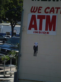
I used sticker paper to draw and print images on. This was successful because I was able to quickly put up my drawings in a nonpermanent way.  The statement that my public art piece in the first picture made was that unwanted jobs just for money can turn businessman into robots. The second piece was about how people are so drawn to money and how it is almost hardwired from the beginning. The location for this could have been better if I had known we were going to pass a bank. I was not able to see the public's reaction to my pieces but I was a little nervous putting it up.

Wednesday, May 9, 2012

"I went into the forest and I found you"

        We often find the most unusual things in the most unusual places. One of my favorite things about street art is how it can be found in the most unexpected places and have the power to change the rest of your day and even your life. For my piece, I wanted to make something that would make people think. "Where is the forest?" "Who did you find?" ect. I want people to relate to what I say and I want my work to be open ended. I also think that when you incorporate words and visual art together, the two medium work with each other to create a new message. The "forest" is in the brightly colored arrows. If my piece was just of the trees, or just of the words, I don't think it would have been the same. I hope that people see my art and are prompted to think about what I was trying to say. The fact that the message is public makes it universal which I think is very powerful and freeing. In the end, I want to see my public work as another extension of what I put into the world.
My Band Aids

For this project I created band aids. The idea for the band aids was to put them on worn down buildings so people could see them and laugh and say they are adorable. There are a lot of buildings in San Diego that are really worn down and that look bad in the city. I thought if I put a band aid on these buildings, it would make them better because it makes them look cuter; making people laugh. Band aids are supposed to heal injuries, buildings have injuries too when the paint is coming off or the building is old, so the band aid looks cute as it heals the building. When people saw the band aids on worn down buildings they laughed and thought it was cute, just the way I wanted them to. It was successful because everything went like I planned, I created band aids that were adorable to put them in old worn down buildings in San Diego, and it made people laugh. :) !
Trinh's Art Project!!
   
The picture above is my art project that I did in May 4th, 2012 at downtown San Diego. It was the first time I ever tried this type of art. It was a wonderful experience.
     Through this piece, i want to communicate the meaning of it with other people:
"You never know how close you are so don't ever give up your dream"
     It was really excited when i was putting my piece up. At first, I was nervous a little because I thought someone is going to ask me to take my piece down but i didn't mind anymore because I was spreading a good message. I'm really happy because people love it. I put the picture on my facebook and other social website and i've been receiving possitive comments.
   For this project, I mainly used paper and sticker to keep on the wall. First I drew out the man and diamonds then cut it out. When in downtown, i tried to find scratched and paint coming off wall. Finally i found one that perfectly fit my piece. <3