Thursday, June 7, 2012

For Tuesday
Last week on May 29, 2012, I wrote a book called For Tuesday. I wrote the book because I wanted to know what it was like to be creating something all day for one day only about one day only. Often, I feel completely daunted and intimidated by art. I want so badly to make and draw things, but I am afraid that what I make will not be good enough. My book For Tuesday is direct a response to my artistic fears. The book is not written for anybody. The book is not written for my teachers or my friends or even my self to like or even see. My book For Tuesday is written for Tuesday. While drawing and writing the book, I found that I was not afraid if my drawings were bad or if they didn’t make sense. I just drew what I wanted and what I felt. 
While making my book, I also realized that the act of recording my thoughts solidified my feelings more than normal. On a day when I am not writing everything down, I can feel confused and fragmented. But, one Tuesday, their was a strange clarity to my day. When I drew the picture of how I see stress, I felt stress. However, when I was able to sit down and draw a single cup sitting on a table, I immediately felt less stressed. I guess what I am trying to say is that by writing and drawing, I was able to gage how I felt. My emotions were tangible and because of that, I was able to think and function more intentionally. For example, there was a part of my day when I was sitting in the music room, and a couple of students were really getting me down. On a normal day, I would probably bi-pass my emotions and distract myself by playing on my computer or Iphone. But, instead I wrote down something like “I am going to be kind and patient and loving to others because I want them to do the same for me”. 
This project of making my book really inspired me. I want to spend more time recording and journaling my Tuesdays because Tuesday really is the best day of the week. Tuesday is funny and smart and nice and cool. No wonder I wrote Tuesday a book, he/she deserved it!

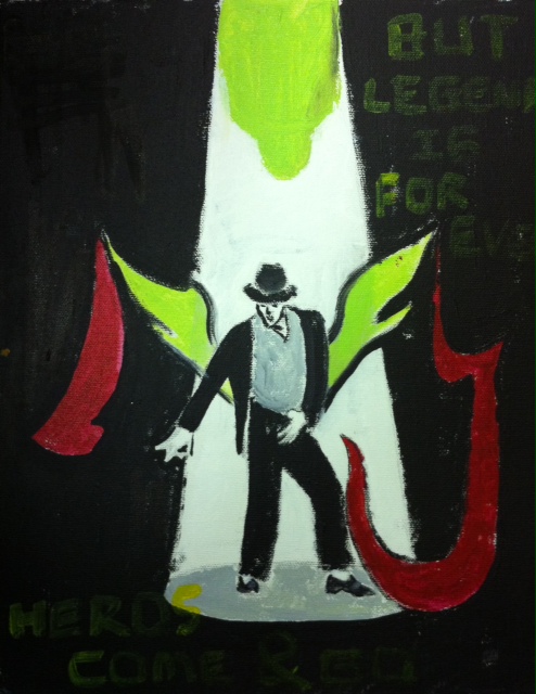
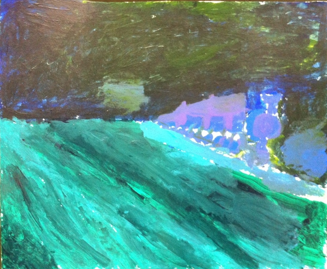
A used a lot of crosshatching while making this book because I wanted it to be messy looking. I also chose to have a stylistic look. There is also some sweet symbolism in my book. I also use pattern, and repetition in the book. The outside of the book is textured and uses cool colors.

"Wow" Nature


My project was a small paper with a print saying "wow". I wanted to make a statement that every piece of nature is beautiful. I really don't know how the public reacted to this because you really had to look to see it. I felt really good putting my piece up for everyone to see. I used paper, popsicle sticks, paint, and a block print. It was pretty successful. It was located in the dirt before trees and in various pots. My statements gave a bit more color to the trees and to the flower pots. I think that if I had the time I could improve with making the block print and making the paper a bit bigger. 

Sophie's Portrat Drawing


     I was inspired to do this project because I thought that Taylor Swift was very pretty! The medium that I used is Pencil drawing. I thought that the pencil would be more fun to use because I am a big fan of playing with different shading methods. I created this project by using a 1 to 2 inch grid. My success had been using the grid to help me but I had trouble making it look like the photo. After long days of trying to fix it so it looked just right, I gave up the grid and made it look totally different. Different, as I found, looked better than the original.
     I was resourceful when making this project because when the grid was too big for the paper I cut the size to a smaller grid and now it doesn't even look like I did anything to it! I was intellectually curious because I was willing to try to use the pencil and I found that I liked it a lot. This piece is representing the quality that I put into all of my art work because I take time doing my art and fix all the mistakes that happen so it will look perfect!

Ela's Portrait Drawing


       I chose to draw a portrait of Harry Potter, because I really love the books and movies. I created this picture using a realistic grid drawing system, and then making in to scale. This ensured that my piece would turn out balanced and symmetrical. I enjoyed making the outline of the face, as well as the eyes and glasses.  However, the hair and shading were a challenge. For the shading, it was difficult to use gradation. I decided to use different shades of pencils as my medium, because of the amount of detail in the eyes.

       I was resourceful in this piece by asking Christy and my classmates questions, and looking up different ways of shading online. I was intellectually curious, because I tried to figure out different ways to make my project look unique. This piece represents my work this year, because I put a lot of time and effort into all my projects.

Mikayla's Still Life Drawing


       I was inspired to draw this still life artwork because I was interested in learning how to shade and shape pieces of fruit. I created this piece by drawing the basic shapes and then going back and adding lots of detail and value. I was very successful in the shading and my biggest challenge was probably the grapes going back and forth with the highlights and shadows. The medium that I used to complete this project was black chalk because it is very compatible to work with and it smudges easily.

       I was resourceful in completing this piece by looking up how to shade black and white so I could use highlights in my project. I used intellectual curiosity by asking Christy lots of questions and I took my time to make sure my fruit plate was balanced. This piece represents the the quality of work that I have completed this year because I have learned so much about symbolism and I have excelled and pushed myself to the best of my abilities in this class.

Justice's Portrait Drawing


My inspiration for this project was the singer/actress Lindsay Pearce. Our assignment for art was to make a portrait. I choose to do a portrait of Ms. Pearce because to me she’s inspiring. She was deaf for the first six months of her life, and then by miracle she regained her hearing and started in the world of musical theater. Recently she won runner up on The Glee Project and this past spring she starred as Wendla Bergmann in a production of Spring Awakening. This portrait is of her playing that character. I created this portrait through the process of gridding. First I found a photo of her and printed it out on a 8½ in. by 11in. piece of printer paper. Next I measured the photo and made dash marks at the edge of each inch. After that I made lines over the picture so that they made 1 inch box squares all across the page. The first step in creating the piece itself was to copy the boxes onto a larger piece of artist paper, but this time instead of 1 in. x1 in. boxes they were 2 in. x2 in. Next I copied what was in each specific box to the boxes on the semi-blank paper. Once I had the outline I went into detail and made it look more lifelike. Then came the hard part: to decide my medium. For my medium I used charcoal and colored chalk. I used this medium because you are able to smear and really work it to move the way you want it. At first I decided to use black and white, and used smudging and gradation to create the shades of grey in between.  I did some research on black and white art pieces and found one where there was a single pop of color. I liked this so much I decided to use it in my piece. So I took a light blue piece of chalk and made the color in Ms. Pearce’s eyes. However it wasn’t always easy. Creating her face was really difficult; trying to make her nose fit and not be larger than her face entirely. Something that I feel I was successful at was staying on task and concentrating on my portrait as I created it. I also feel I was good at balancing the contrast of light and dark shades, which I used for a blurred background. For the final stage of the project, we sprayed the portrait so that the chalk wouldn’t smear.

I was resourceful during this project because I looked up different types of chalk as well as different types of black and white photography. I also in the beginning, took a while finding the perfect Lindsay as Wendla photo. I finally went to the website that was selling tickets for the show and used one of their headshots. I used intellectual curiosity to enhance my project by looking at other portraits and seeing how artists crafted faces and if I saw something that was interesting I tried it out on a separate sheet of paper and if I liked it, it went onto my portrait. This piece represents the quality of the work I’ve completed this year by showing the project that I spent the most time, thought and heart on. I work on all my pieces with a lot of passion and heart, but with this one, I kept revising until I got it as perfect as I possibly could. But there is no perfect perfection. But I worked until it was as close as I could get it in my eyes. Something I put my heart into, something that was special.


Wednesday, June 6, 2012

Tita's Final Project Fashion Design


   For this semester in art class, we had to do a free project. For this project I decided to do something that involved me getting better at something I want to do when Im older and I go to college; Fashion Design. I decided to buy a journal and make it so it would be my first journal. I made 20 different sketches of different pieces of clothing, faces, body poses, all of it to help me for college. My inspiration was college. I feel like if I want to be a Fashion Designer I have to move right now and start sketching. I created 20 different pieces, 5 of them being the best ones. My biggest challenge was at the beginning, because it was my first time trying to draw body poses and it was really hard. After practicing I got better and better. Practice makes Perfect. I drew my sketches with pencil, and I colored some of them with markers. I added balance in the pieces of clothing I designed with the colors I picked, symmetry and asymmetry, because some are the same on both sides and some are not, and finally I added a variety of colors, because I love playing with different colors. The style I like in clothing, is really preppy, I like cool colors and warm colors. I also love wearing patterns and I hope this summer I can learn to sketch with patterns.
    I was very resourceful when I was completing this piece because I always found a way out of my problems, if something was really hard to do I always found a way to fix it or to make it better. I was resourceful because when I ran out of paper to draw my sketches, I used leafs. (Selena taught me that being resourceful is finding ways out of your problems). I was Intellectually Curios too, because I was very interested in learning how to sketch. Before I started I thought it was going to be really hard to focus on this project, it was hard at the beginning but now that's all I do at home; I sketch! These pieces of work represent my quality of work because I was always very clean whenever I did a drawing or a painting, I always wanted everything perfect, and when it wasn't I would always try to make it perfect. I think this was my favorite project of the year because I know that is going to help me with my future since Fashion Design is what I want to study when I go to college. :)

Alex's Grade Defense

My inspiration for this project was a movie I watched that was done completely with clay. This piece was much more difficult to create than I had thought at the beginning. By the time I was almost finished with the movie I started to get the hang of it. To create this piece I used clay and paper. I used the paper background to create depth of field. The character was asymmetrical to make it more dominant in the scene. I did not use a color scheme because I was limited by the amount of clay and colors I had. Pattern  and repetition were necessary because I had to repeat each image making subtle changes.

I was resourceful when completing this piece because I tried a new medium and used a song I created to put behind the movie. I used intellectual curiosity to enhance this project by researching different clay animation artists. This piece represents the quality of work that I completed this year because I have tried many new mediums this year and although each project took a long time, I was able to learn new techniques.

One Point Perspective of a City From Above ( Sierra's Final Project)

This piece was made from oil pastel and sharpie. It is a one point perspective of a city from above.

Lady Concentration


I wanted to do this because I had made one lady (upper left) and she just looked so lonely that I had to make three more. I used various types of pencils to sketch out the faces and then shaded using my fingers. I was very successful at shading, but I had problems trying to get all the proportions right and the eyes level. I used pencils because I am the most comfortable using them and calms me to do sketch. Not many materials are need just pencils and erasers.

I was resourceful because I used the internet and various books to find out how to do different hair types and reference to proportions. I used intellectual curiosity to figure out how I could make different emotion in the eyebrows, eyes, and mouths. This piece represent the quality of my work because it shows how much I have improved from the beginning of the year to the end.

MJ: legend is forever


Final

Michael Jackson is one of my favorite super stars in the US. But, unfortunately, he past away in 6/25/2009. It was a really bad news not only for me but also for the whole world.  And his death
anniversary is coming in 3weeks so i got the idea of drawing a picture of him. Actually, this is my first time using water color. And i used balance, color scheme, variety, depth of field, value and repetition of color. It is much more difficult than I imagined. Especially, when I drawing the detail parts pencil is much easier. And at first I found a picture online, but i decided to create an original piece.  It is MJ standing in the middle of the stage with his name "MJ"(and i made the "m" as the shape of a wing). And i wrote" heros  come and go, but legend is forever!"


Grade Defense
     For the final, i used many things about MJ that i knew before(like his pose in the picture).  and i think it is a perfect semester for me i really enjoyed all those projects and also i tried pretty hard and tried many things  that i never tried before.


Trinh's final art project


     It's really close to summer and I get to see my family again. So The ideas just came to me when I thought about my family. This is a symbolism pieces of a picture of a mom holding her child. I painted this one. I really focused on depth of this piece, her "eye" her hearts. I used variety colors, warm and cold tone color together. It took me really long to blend and transition between to colors. The balance of the color scheme make this piece looks great, much more than i expected. 
     I showed this piece in Grauer's Art Showcase this year and I a lot of compliment from student and parents. The final piece is not the first time I make it. I tried and failed 2 times before completing this one so I did put lots of work and thought into it. I asked Christy for her opinion, looked up on the internet for tips of how you blend color smoothly. This piece is the most satisfied piece that I did this year because I lots of research for it, tried may times and finally It turned out great. 

Holly Pettis' Final Project


My inspiration for this project came from a photo I found that I loved. I really wanted to do a concentration of different painting of the same size, but as I began my project I found that I did not like that as much because it did not add to the main painting, but made it confusing. I wanted to paint a person because I have never really done that. I wanted to use texture which I used in her hair. I created this piece using oil paint on canvas. I love oil paint and it was easy for me to use when painting my piece because I had to create a lot of value in her face to make it more realistic. There is a gradation throughout her face in the colors that I used like her skin tone as well as in her eyes. The painting is square and balanced on both sides. It is balanced because the face covers basically the entire canvas and the hair covers both sides of the face which balances it out fully and makes the painting symmetrical especially because it is a face it has to be symmetrical if I want the face to look normal and not distorted. It was really challenging for me to make is symmetrical and both sides of the face to look the same and to get the shadows right on the face. The colors on the lips were a huge challenge for me to make it stand out but at the same time to make it not so noticeable. The lips definitely have some dominant colors in them and I wanted to use the same color I used for her eyes as I used in the background which was a turquoise blue. I think I was successful at creating texture in her hair and making it look like hair and her face is more realistic which I like instead of it being more abstract which I wanted to stay away from. I liked using oil paint definitely better than using acrylic because I can keep working on blending colors without having to worry about it drying before I had time to finish it. 

Emma's Kurt Cobain

I was inspired to do this project because Kurt Cobain is one of my idols. I love his music and art. One of the biggest challenges I faced when creating this project was getting the proportions and depth of field right, and perfecting the subordinate details. I used pencils on paper because that’s what i’m best at, and I think it’s easier to shade and use gradation. It also fits the color scheme best. I used a variety of different values  of pencils to improve the shading.
I was resourceful when doing this project because when Christy wasn’t available I asked fellow classmates for help, and opinions. I was very intellectually curious when it came to this piece because I have tried to do this piece on my own before but it never turned out quite right. I was very curious to get help on it and see what I could do to improve it. I think that this piece shows how much I have improved over the past year, with drawing, attitude, and pretty much everything.

Savanah Stuart's Final Art Project & Grade Defense


Grade Defense:
During this project, I should my ability to be resourceful by first off finding this picture on Instagram.  I stumbled upon a very similar piece that looked like it had been made on Photoshop and I instantly new that I wanted to recreate the piece.  I chose a different picture to base my paint-by-numbers on, but the overall concept is the same.  I was also resourceful by using Christy as a resource when trying to figure out how I could best translate the picture of the tiger cub into sections for the paint-by-number idea.  While I was completing this project, I used intellectual curiosity to come up with different ways on how to execute my project.  From the beginning I was very excited to complete this project.  I really wanted to to complete this project to the best of my ability and that pushed me to put in a lot of effort into my piece.  I didn't want to do a final project just to do one, but rather because I was very excited to try something new and less detail-oriented.  I would say that this piece represents the quality of my work because I put in a lot of hours outside of school to complete this project.  For most of my pieces, I had to spend extra hours outside of school to complete them.  I am very aware of details and I usually pick very realistic pictures to convey into my art.  This last project was my first 'real' abstract painting this year.  Overall I am very happy with all of the pieces I produced in Art Class this year.

Final:
As mentioned above, my inspiration for my final project came off a picture I found on Instagram.  A celebrity had posted a picture of a piece of art she saw in New York.  Once I saw the piece, I immediately fell in love with it's creativity, color, and variety.  I had never seen an abstract paint-by-numbers like this one.  In order to create this piece on my own, I first needed to find a picture that I wanted to use for my piece.  After searching for what seemed like forever, I finally found a picture of a tiger cub that I really liked.  The inspiration piece was also a tiger, and I picked a tiger as well because it was the perfect animal to use when trying to section off the picture.  All the stripes made it perfect to add color and provided a perfect layout for my paint-by-numbers.  Overall this piece was very easy to work on since I didn't have any reference picture.  I had the creative freedom to use whatever colors that I wanted and add whatever I felt was necessary at the time.  My piece has a lot of repetition of bright colors, using primary colors, secondary colors, and everything in between.  I wanted to make the piece more abstract by adding unrealistic colors to the sections.  The big sections of color dominate the the piece and immediately draw your eye to the painting.  Unlike the original inspiration piece, I painted my piece using acrylic paint.  I also used Sharpie for the outlining of all the sections.  I didn't use too much gradation, but in some sections, such as the nose, I added gradation to add some more variety in the piece.  Overall I am very happy with my finished project and I am very glad that I chose to end the year on a piece that I loved creating.

Box O' Blocks by Will Brooks


I used many different perspective points. Each Shape is from a different perspective on the paper. Only one of the shapes is from the same perspective of another. This gives it a very confusing effect along with the different types of shading. My foreground, background, and middleground are very confusing.  Some of my shapes are in the middleground and the others are in the foreground. All that is the background is a shade of purple. I used the cool color theme. I did this because I prefer cool colors by a lot. I had intellectual curiosity and resourcefulness by looking shapes up on the internet and I asked a question. It showed that I can make cool art, as long as I have a deadline.

Tuesday, June 5, 2012

Zeecy's Final Project (&GD)

My canvas painting started out as a clear painting of a dancing girl, but finished up as a sort of silhouette.
My inspiration for this project was a critic's review on Andrew Warhol's paintings. The review was along the lines of "It looks like he just shot the canvas." When I heard that comment, I thought it sounded like a cool idea, so I filled some $1 squirt guns with watered down acrylic paint and covered some areas with masking tape and began shooting.
My first draft of the painting was made by sketching out a dancing figure on the canvas and covering the figure with masking tape and shooting paint on the canvas for the background. I took off the tape and shot at the bare canvas with a different color. The squirt guns made exactly the kind of texture effect I wanted. When I took off the last bit of tape, I found that the paint had actually bled through it and stained the canvas. Since I was frustrated that it hadn't worked, I filled the squirt guns with more paint and shot at the canvas with different colours, blindly.
I also ran into trouble with the paint/water mixture. The first time I tried, I had put in too much water and the paint was really thin on the canvas. I used acrylic for it's bright colour, and once I put more paint into the mixture, the colour worked very nicely.
The second (final) draft of the painting was a lot better. After attacking it with different colour schemes (cool colours over warm colours), I found it created a cool illusion of depth. The silhouette, though behind the paint, appears to be on top. The pattern is repetitive, since the squirt gun just created a splatter effect, but the colours gave it variety. Strangely enough, the white paint on top was the most dominant colour. It stands out clearly, like a white film over the painting. The repeating pattern of the splatter paint makes the asymmetrical painting look almost steady and symmetrical throughout the canvas.

GD:
I was resourceful before I started the project. I knew what kind of effect I wanted, but didn't know how to get it. When I heard "shooting the canvas," I started trying to find ways to mimic the effect of a shotgun on canvas, and finally found that squirt guns would do the trick. I was intellectually curious as I tried to find a way to make the painting so I would finally be satisfied with it. I don't think this piece represents the quality in my work, but how my work has changed through the year. My work went from simple sketches to simply laying paint on canvas, to experimenting with different ways to put the paint on the canvas, to finding a style of painting that I really enjoy
.

The Train to Somewhere by Dante


  1.  I used the 1 point perspective in order to create depth in my perspective train piece
  2. In the background their is a night sky, in the middle ground, there is a turquoise track and a purple train, and in the foreground, there is a light green grass. 
  3. I used cool colors. I chose this color theme because I thought it would best show a train in the night sky. 
  4. When I was creating this piece, I showed resourcefulness when I was using different materials. 
  5. In was intellectually curious when I was looking for different ideas because I wanted to enhance a simple drawing. 
  6. I think that it represents it in the quality of the materials I was using in class, it showed how I can make simple things different and how I use different kinds of materials. 


Tia in the City

In this perspective project, I used one point perspective. In the foreground I have a big brick blocking the rode. The rode and buildings are in the middle and background. In this piece I used all the color themes like Primary, right side of the city, Secondary, left side of the city, worm, the background of the brick and cool, the letters on the bricks. I couldn't pick a theme so I used them all. I was intellectually curios about how to make a one point perspective piece, so I researched. This project represents the quality of work I have completed this year because I was focused when I made it, it was turned in on time, I did what I needed to do to finnish it and it was colorful like many of my other projects.

The Heart of Pollution by Dante


The title of my public art piece is the Heart of Pollution

I created this piece as a statement about the environment could have many factories that pollute

I put this piece in the Grauer School quad because I wanted to see my reflection and prediction on the future

I created my piece by gluing water bottles together using hot glue in a formation and then spray painting them representing factories. Then I Stuffed cotton balls into the top bottle representing smoke and pollution. Finally I posted signs on my water bottles and created fake trees using thin sticks and tissue paper.  

The reason I used these materials was I wanted the water bottles to also represent the future of the amount of trash on earth. The rest of the materials were supporting the idea.

Kate's Perspective Project

In this picture I used one-point perspective. A road is in the foreground, a house in the middle ground, and the sky is in the background. I used secondary colors in the foreground and middle ground. The sky is primary colors. The house is secondary colors with primary accents. I used this color theme because I like all colors, and I thought this was a good way to use most of them. I was resourceful by using the color wheel to help me decide what color theme to use. I used intellectual curiosity by using colors in places I might not have before to see if it looked good or not. This piece represents the quality of my work because it is very colorful and neat. 


jordan perspective


I used a deep form of perspective so the viewer is drawn to the psychedelic black and white squares. My foreground is the bigger squares my middle ground is the doors and the background is a black tile in the middle of my page. I used cool colors as my theme I choose this because I could make my doors pop with these colors. I had to be resourceful by asking my classmates about the color wheel. I enhanced this project by looking at other psychedelic pictures. It represents all the work I have done this year by the bright colors.

Fallen Greek Temple by JT


This is a 1 point Perspective project. In the foreground there is a half cut off cracked column. In the middle ground there are two columns and in the background there is very cut off column and three connected columns with intact capital. I used cool colors to color in some of the columns and left the one in the background uncolored on purpose. I used my colors around me instead of waiting till the next day to get the right colors. I like to learn about ancient Greece so I used my curiosity to enhance my project. I used many cool and weird colors with a subject that I am interested in. 

Light bulb lit room By: Bennet


Light bulb lit room 

By: Bennet Berlin

For my project, I used one point perspective. In the foreground, is the table, in the middle ground, is the light bulb, and the back ground, is the mountain scene. I used the primary color theme because I wanted the room to be very simple, with a table, lightbulb, window, and primary colored walls. I was resourceful when doing my project, because I used all the time I could in art class to finish this. I also used my time at home when I could to finish it. I used intellectual curiosity when doing my project because I did further research in and out of class. This piece of artwork represents the quality of work I did this year, because I spent a lot of time on it in and out of class. I also stayed after school to finish my work in the beginning of the year, which I also did for this project. 

Monday, June 4, 2012


Random Floating Blocks
By Kellen Chan
   I used 1 point perspective in this project to create depth. the foreground is the large blocks that you see in the picture, the middle ground is the medium rectangular prisms, and the background is the small cube you see close to the center. I used primary colors for my color theme because I didn't want it to be monochromatic and i wanted it to be simple and original. I was resourceful when completing this project by using my time wisely in class and using my supplies to my advantage. I used my intellectual curiosity to enhance my project by looking up examples of perspective blocks to give me ideas. This piece represents the quality of my work that I completed this year because I worked hard on it and I did my best with it.

Nuria's Final Project


FINAL & GRADE DEFENSE

My inspiration for the last project was Kelsey's street art project with all the colorful trees. I really liked that it was so colorful and catches the eye, so I wanted to do something with a lot of colors too,
so I decided to paint a very colorful background on a small canvas. 
And then I found this amazing picture on the internet of a girl who is jumping out of the water with her arms up in the air, her hair flying around and a water-drops-wave coming out of her swinging hair, splashing over her head and then in front of her face, the water drops are falling down.
I instantly loved this picture and decided that I was going to draw her silhouette with the water (drops) all around her, in black, going over to grey and white, over the colorful background.
I used acrylic colors and different kind of brushes to get a cool, different structure on the background.
I had to create a depth of field around the silhouette and the water, so that it doesn't just seem to be taped on it, but more 2D and a part of the picture. The dominant colors in my painting are black (silhouette) and red, yellow, green-blue and violet for the background. There are also a lot of other colors, but they are subordinated to the ones that I have listed before. I have kind of a color scheme in my painting too with the cooler colors more on the right side and the warmer colors more on the left side.
I think I succeeded in doing this last project, because I like my colorful background and I had a lot of fun painting it, and I'm also really proud of my silhouette of the girl in the water. It took me a long time to paint the silhouette and the water, but I really like how it came out.

I was resourceful in completing this piece. I used the internet and the scanner to make the picture of the girl a little bit bigger. I also used a lot of different acrylic colors, different brushes and different kind of painting styles.
I think I enhanced this project in being intellectually curious in really trying to understand how the water is real and to get the water perfect and to make it more 'organic' on my painting.
I think this last piece shows that I really improved myself in painting, drawing, understanding how to paint more realistically and in developing my own kind of painting style.

Natalie Espinosa's Grade Defense


I was resourceful when completing this piece by researching many different woman artists before i found Rebecca Coy. I used intellectual curiosity to enhance this project because I really did want to learn about different woman artists and how they contributed to the art community. This piece represents the quality of work that i completed this year because it took me a while to finish it because i worked hard and used different medias such as, Acrylic and Oil paints.

My artist of inspiration is Rebecca Coy. She is an abstract, contemporary artist from New Jersey in her late 20's. Her work inspires me because you can see the passion and feeling in her artwork and it is spontaneous instead of a structured realistic painting. Everything in life is realistic. Her abstract art gives you an escape from reality and a look at the depths, emotions, and greater things of our world. A lot of people can create a still life picture copied from a photo or by looking at something. However, most abstract art comes from within and uses creativity by coming up with your own art instead of copying something that already exists. I think her work represents our core value of resourcefulness. I know resourcefulness is supposed to be about looking other place to find the answer. However, Rebecca Coy does something even better than that. She looks inside herself and in my opinion that is the best way to be resourceful. I incorporated this into my piece because I tried to be creative and resourceful by finding a balance with my color scheme by using a variety of colors that complimented each other. I used cool colors in my painting and the background is symmetrical. However the dominant part of the piece, in the foreground, is asymmetrical.

Julia Chuang's Final Project "Carnival of Paint??"


My artist of inspiration is Amy Shackleton.  She makes drip art. She is currently 25 years old. Her works inspires me because it is amazing! She makes beautiful landscapes from dripping paint and rotating the canvas! One of her most famous paintings she creates depth of field in a landscape. In the foreground is a river, in the middle ground are fields and cliffs, and in the background is a mountain and the sky. The color scheme includes warm colors for the cliffs, and cool colors for the river, fields, and mountains. She uses some gradation when she uses different shades of each color. Her piece is asymmetrical because it is not the same on both sides. The dripping paint creates almost a pattern of repeating lines in the cliffs, fields, and sky. The dominant thing in this painting is the mountain even though it is in the background; all the middle ground objects are made with dripping lines leading toward the mountain. Her work represents the curiosity in intellectual curiosity because she makes art in way others haven’t, which also inspires me. I did this in my piece when I used the marshmallows to drip paint and cause the paint to split off into different directions.
            I was resourceful when creating this piece when I did not know what to use to make the paint split. I ended up using foam marshmallows to split the paint. I used intellectual curiosity when I researched how she made her paintings when I didn’t need to. My piece represents the quality of work that I completed this year because it is fun, colorful, took time to think of, well made, has a nice color scheme, and I experimented with different ideas before I chose one.